
Agency Rebranding and Logo Progression
The agency rebrand began with a title change. For the modern take, I created the fusion term "Adhaus" which alludes to the company's Dutch + German heritage as well as maintaining the function of the company in the title.


Outcomes
A name change that reframed 90+ years of history in an impactful moniker, giving the agency a cohesive identity it could carry into its next chapter.
Concept Exploration

Architectural Concept:
Inspired by the arched facade of Holland's historic industrial building. Strong visual anchor but too literal, felt more like a real estate mark than an agency identity.

Typographic Concept:
Explored a purely typographic direction built around the HA monogram. Flexible and modern but lacked historical weight and "HA" association was too apparent.

Early final direction:
Modern + architectural. Clean directional lines lead the eye around the wordmark. Direction was locked but typographic balance was not yet resolved, leading to further refinement before finalizing.
Outcomes
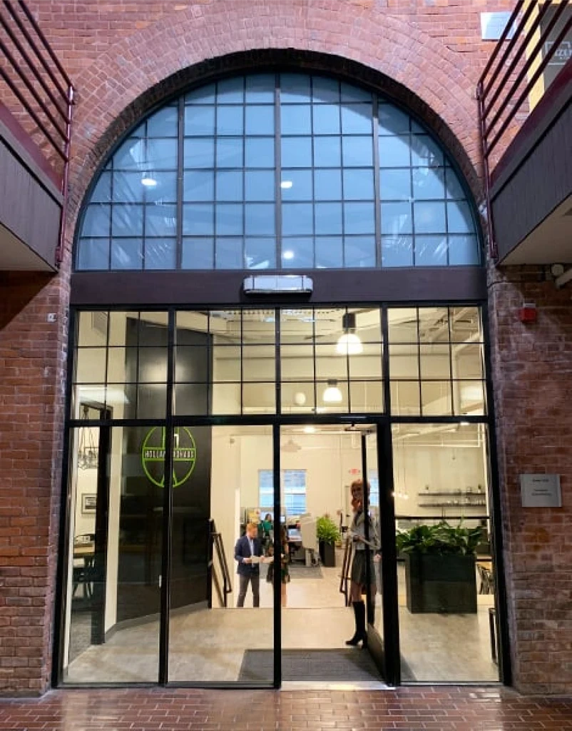
Multiple directions explored across several rounds before narrowing to three final concepts. Each was informed by the agency's history, multi-generational roots, and the client's request to incorporate the office's architectural motifs into the final logo design. Clear rationale was documented at every stage.
Final Identity System
Delivered a complete visual language: logo lockups, color system, typography, and lockup variations. Optimized for digital as well as print, across all brand touchpoints.


Outcomes
Final brand system was comprehensive and developed for flexibility across digital and print applications, ensuring visual consistency at any scale or context.
Brand Applications
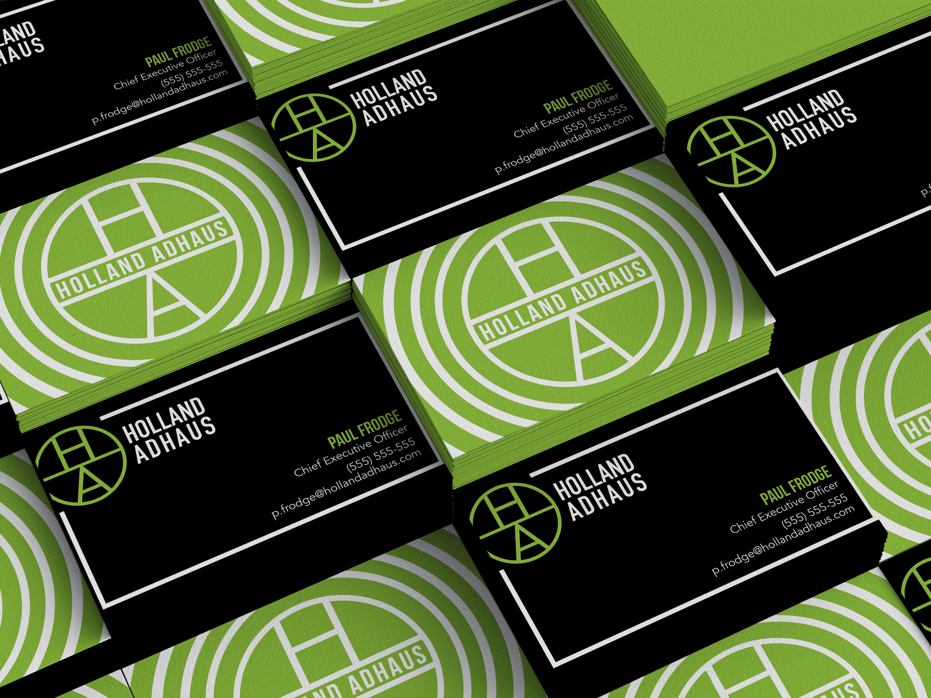
Identity applied across social, web, print, and real-world touchpoints, demonstrating the system's flexibility and consistency at scale.
Digital

Print + Physical

Agency Merchandise


Outcomes
Identity system successfully rolled out across digital, print, physical environments, and branded merchandise. Website traffic and social following both increased following the rebrand launch.